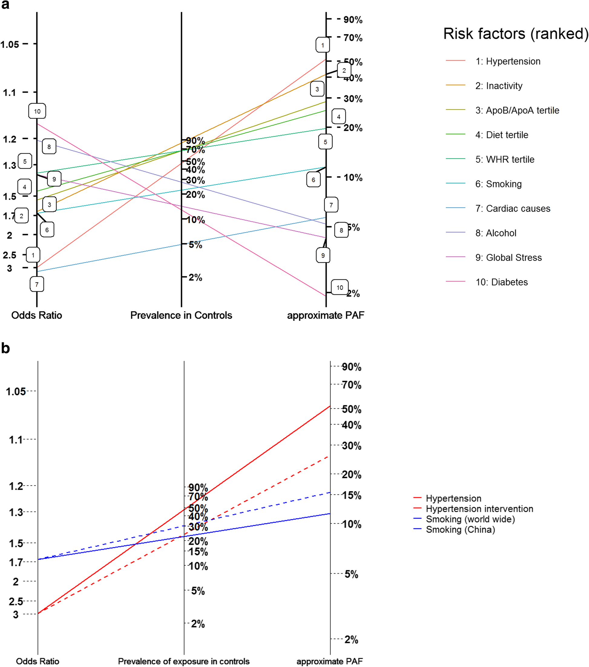
Fig. 3
From: Graphical comparisons of relative disease burden across multiple risk factors

a/b Alternative formatting of attributable fraction nomogram displaying estimates of risk factor prevalence, average Odds Ratio and approximate PAF for the 10 INTERSTROKE risk factors. The prevalence, OR and approximate PAF for a particular risk factor are identified on the same line. Here the left hand axis records estimated average odds ratios and the middle axis records estimated prevalence. Differing interventions that might reduce risk factor prevalence might be compared by rotating the line for a given risk factor using the left axis intercept as a pivot. For example, in the bottom pane, the difference in approximate PAF between the red dashed line and the solid line estimates the % reduction in the prevalence of stroke from an intervention that halved the prevalence of hypertension. The blue dashed line estimates the PAF for smoking in China (where the prevalence of smoking is higher than the global average)